
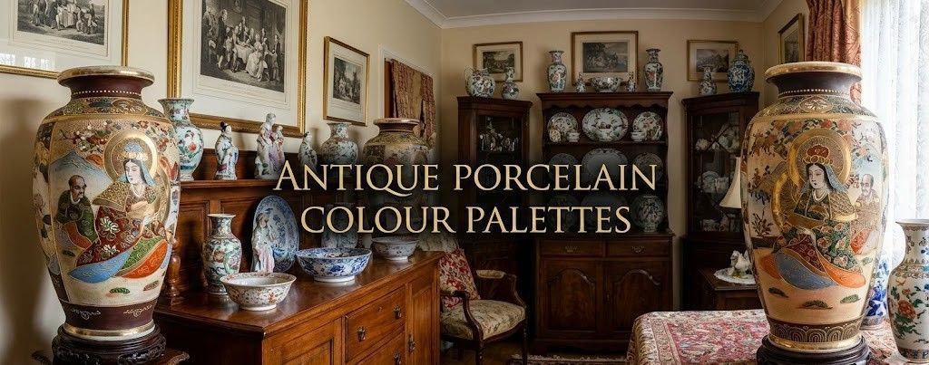
Identifying Antique Porcelain by Colour: A Practical Guide
Ceramics – the humble material crafted from clay and fire – have held a special place in human history for millennia. Their inherent beauty and functionality have transcended cultures and time, finding a place not just in museums but also in our everyday lives. Antique porcelain sits at the centre of this story. It’s admired not only for its beauty, but also for its history, craftsmanship, and the quiet sense of character that comes from being handled and used over generations.
The allure of antique porcelain lies not only in its aesthetic appeal but also in its historical significance and potential value.
Part of the magic of antique porcelain is in the details. A faint ripple in the glaze or a slightly uneven brushstroke shows the hand of the person who made it. These small imperfections give each piece its own life. A cup, bowl, or vase becomes more than an object. It becomes a story.
Antique porcelain, such as Chinese porcelain and Japanese porcelain like Satsuma, is a great conversation starter. A hand-painted plate or a vintage celadon vase invites people to look closer, ask questions, and share memories. Good pieces add warmth to a room and spark a natural curiosity.
Also Read: The Allure of Meissen Porcelain
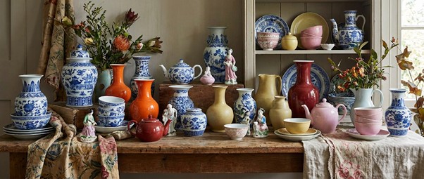
Colour Palettes: What They Mean and Where They Come From
Colour is one of the strongest clues to a piece’s origin, technique, and era. In antique ceramics—especially porcelain colour choices were limited by the chemistry of minerals and the demands of high-temperature firing. Those limits helped shape entire traditions.
Below are some of the most common colour groups and what they tend to signal:
A. Earthy Tones for Timeless Charm
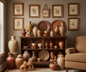
These colours come from iron-rich clays and simple mineral glazes. You’ll often see them in stoneware and early regional wares, but they appear in porcelain accents too.
- Beige
Warm, quiet, and natural. Often seen in early Chinese and Korean porcelains, where the clay or slip carried a hint of sand or iron.
- Brown
Linked to iron glazes. Common in Song dynasty Jian ware and in Japanese tea ceramics, where the depth of brown is prized for its rustic strength.
- Terracotta
More typical in earthenware, but sometimes seen in decorative elements on mixed-technique pieces. It signals a handmade charm and a close tie to the earth.
B. Cool Blues and Greens for a Calm, Refined Look
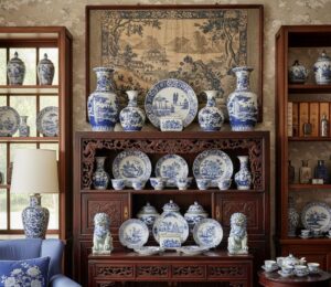
- Blue
A symbol of tranquillity and quiet strength.
Cobalt blue is the most iconic porcelain colour in the world. Blue-and-white Chinese porcelain became a global luxury item, influencing European factories like Delft and Meissen. Decorations often show landscapes, waves, flowers, or symbols of resilience.
- Green
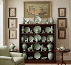
A colour of nature and renewal.
Celadon glazes, ranging from pale jade to olive, were admired in China for resembling carved jade. They were later prized in Korea and Japan as well.
- Turquoise
Cool, clean, and soothing.
Turquoise glazes appear in Islamic ceramics, Chinese Qing pieces, and later European wares. They’re often used to highlight decorative details or add a sense of freshness.
C. Bold Reds and Yellows for Eye-Catching Accents
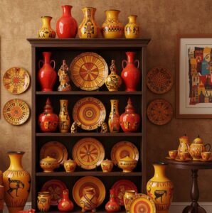
- Red
Energetic, festive, and rare.
Copper-red glazes were notoriously hard to fire evenly. Successful pieces—especially from the Ming dynasty—are highly valued today for both their colour and their technical difficulty.
- Yellow / Orange
Lively, warm, and joyful.
In Chinese porcelain, yellow was historically linked to the imperial court. In later European work, it became a cheerful highlight for florals and tableware.
D. Neutral and Pastel Tones for Soft Elegance
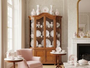
- Ivory
Quiet, warm, and classic.
High-quality porcelain naturally fires to an ivory tint when the clay carries trace minerals. It pairs well with delicate painting.
- Pink
Associated with grace and lightness.
European factories like Sèvres porcelain created signature pinks such as “Rose Pompadour,” which became popular in Rococo and later decorative pieces.
E. Dark Shades for Depth and Opulence
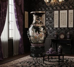
- Purple
Rare and symbolically rich.
In Chinese tradition, purple was tied to the divine and to immortality. Today it can read as both regal and romantic.
- Black
Mysterious, dramatic, and grounding.
In China, black glazes symbolise depth and spiritual protection. In Greek pottery, black figures on red clay were a hallmark of classical art. In Egypt, black represented fertile soil and rebirth.
- The Colour of Innocence
White
Pure, simple, and timeless.
White porcelain made from kaolin clay became the standard of excellence. Its clean surface sets off both painted decoration and food, which is why white dinnerware remains so popular.
How Glaze and Firing Shape Colour
The colour you see on an antique porcelain piece isn’t just a pigment. It’s the result of minerals, heat, timing, and atmosphere.
- Underglaze colours like cobalt blue are painted before the clear glaze and fired at very high temperatures. Only a few pigments can survive this, which is why blue dominated early porcelain.
- Overglaze enamels—reds, yellows, pinks, greens—are added after the glaze and fired again at a lower temperature. This second firing expanded the colour palette dramatically.
- Mineral oxides shape the final hue. Iron gives greens and browns. Copper gives reds.
- Firing atmosphere (oxygen-rich or oxygen-poor) can turn the same mineral into completely different colours.
Regional Traditions That Shaped the Palette
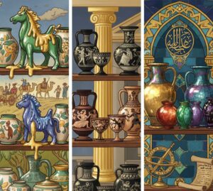
- Tang Sancai (China): Known for splashed glazes in green, yellow, and creamy white, with blue appearing as a costly luxury.
- Ancient Greek pottery: Famous for red-figure and black-figure work, often inspired by the look of precious metals.
- Islamic pottery: Innovated lustre glazes and “seven-colour” mina’i ware, with turquoise, red, green, purple, black, and gold-like sheen.
- European porcelain: Meissen, Sèvres, and others developed signature colours such as Böttger Green and Rose Pompadour, often used in courtly pieces.
Decorating With Antique Porcelain: Simple Tips
- Mix old and new:
An antique vase beside a modern lamp feels balanced and intentional
- Use colour groups to set the mood:
Blues and greens calm a room. Reds and yellows brighten it. Dark tones add a hint of drama
- Let one piece lead:
Pick a focal item and build the surrounding decor around its colour and texture.
- Vary heights and shapes:
A tall celadon vase, a small blue-and-white bowl, and a simple ivory dish can create a strong, grounded vignette.
Giftex: A World of Collectibles Auction
If you’re looking for porcelain and ceramics that bring character to a home and elevate your space, Giftex auctions offer a wide range of pieces. Antique, vintage, hand-painted, or region-specific items can help you decorate with intention and add depth to your space
Conclusion
Colour in porcelain isn’t just decoration. It reflects culture, technique, and history. When you understand what these colours mean and how they were made, it becomes easier to choose pieces that suit your taste and your home. Whether you love the quiet elegance of ivory or the bold energy of copper red, each shade carries centuries of craft within it.